Posted in Lightning Component, Lightning Web Component, LWC, Salesforce

Lightning Web Components for AURA Developers Part – I

The best way to compare the Aura Component and Lightning Web Components programming models is to look at code for similar components written in the two models. The goal of this post is to help you to leverage your Aura components skills to accelerate learning about Lightning web components. You learn how the two types of components work well together.

Prerequisites

Before you dive into this post, complete the Lightning Web Components Basics module, which gives you a great introduction to the new programming model.
I am assuming that you’re familiar with the Aura Components programming model, and we won’t explain its features, except in comparison to the Lightning Web Components programming model. If you’re not familiar with Aura components, start with the Aura Components Basics module.

Component Bundles

The component bundle file structure is different for an Aura component and a Lightning web component. Here’s how the files map between the two types of component.

(Source: Trailhead )

Migrate Markup

  • An Aura component contains markup in a .cmp file. The file starts with an <aura:component> tag and can contain HTML and Aura-specific tags.
  • A Lightning web component contains markup in a .html file. The file starts with a <template> tag and can contain HTML and directives for dynamic content.

Attributes Become JavaScript Properties

Migrate attributes from tags in the markup (.cmp) of an Aura component to JavaScript properties in the JavaScript file (.js) of a Lightning web component.

Aura component:

 <aura:attribute name="recordId" type="Id" />
 <aura:attribute name="account" type="Account" />

LWC :

import { LightningElement, api, track } from 'lwc';
export default class AccountSummary extends LightningElement {
    @api recordId;
    @track account;
        ...
}

The recordId and account attributes in the Aura component become the recordId and account JavaScript properties in the Lightning web component.

The two Lightning web component properties have different decorators. The @api and @track decorators both make a property reactive, which means that when the property value changes, the component’s HTML template rerenders.

The @api decorator marks recordId as a public reactive property. A public property is part of the public API for the component, which means that it can be set in Lightning App Builder, or by a parent component that uses the component in its markup.

The @track decorator marks property as a private reactive property, also known as a tracked property. These properties are used to track internal component state and aren’t part of the component’s public API.

Basic Aura Expressions Become HTML Expressions

Migrate basic expressions from markup in an Aura component to expressions in HTML in a Lightning web component. An example of a basic expression is a reference to an attribute in an Aura component.
For example, the AccountPaginator Aura component uses basic expressions to display the values of the page, pages, and total attributes.

<aura:component >
    <aura:attribute name="page" type="integer"/>
    <aura:attribute name="pages" type="integer"/>
    <aura:attribute name="total" type="integer"/>
    
    <div class="centered">{!v.total} Accounts • page {!v.page} of {!v.pages}</div>
</aura:component>

Here’s the equivalent syntax in the HTML file of the accountPaginator Lightning web component.

<template>
    {totalItemCount} items • page {currentPageNumber} of {totalPages}
</template>

The HTML references the totalItemCount property in paginator.js. The {currentPageNumber} and {totalPages} expressions reference getters that process the pageNumber and pageSize properties.

import { LightningElement, api } from 'lwc';
export default class Paginator extends LightningElement {
    /** The current page number. */
    @api pageNumber;
    /** The number of items on a page. */
    @api pageSize;
    /** The total number of items in the list. */
    @api totalItemCount;
    get currentPageNumber() {
        return this.totalItemCount === 0 ? 0 : this.pageNumber;
    }
    get totalPages() {
        return Math.ceil(this.totalItemCount / this.pageSize);
    }
}

Aura Conditionals Become HTML Conditionals

Migrate <aura:if> tags in an Aura component to if:true or if:false directives in a Lightning web component’s HTML file.
Here’s some conditional markup in the AccountDetails Aura component.

<aura:if isTrue="{!v.spinner}">
    <lightning:recordForm recordId="{!v.accountId}"
      objectApiName="Account"
      fields="{!v.accountFields}" columns="2"/>
</aura:if>

Here’s similar HTML in the accountDeatils Lightning web component.

<template if:true={spinner}>
    <lightning-record-form object-api-name="Account" 
      record-id={accountId} fields={accountFields} 
      columns="2">
    </lightning-record-form>
</template>

The HTML file of a Lightning web component starts with the standard HTML <template> tag, and it can also contain other <template> tags in its body. In this example, the content in the <template> tag conditionally renders depending on the result of the if:true directive.

Aura Iterations Become HTML Iterations

Migrate <aura:iteration> tags in an Aura component to for:each directives in a Lightning web component’s HTML file.
Here’s the Aura syntax in Sample.cmp.

<aura:iteration items="{!v.items}" itemVar="item">
    {!item}
</aura:iteration>

Here’s similar HTML in the sample Lightning web component.

<template for:each={items} for:item='item'>
    <p key={item.id}>{item}</p>
</template>

Stay tuned for next blog post for Lightning Web Components for AURA Developers Part- II.

References:

Lightning Web Components for Aura Developers

Working with Aura and Lightning Web Components: Interoperability and Migration

Posted in Lightning Web Component, LWC, Salesforce

Introducing New Lightning Web Components

Introducing Lightning Web Components

In case you missed it, Salesforce recently announced Lightning Web Components (LWCs) — a new programming model that developers can use in addition to the existing Aura-Based programming model to build Lightning components. 

Lightning Web Components is a new programming model for building Lightning components. It leverages the web standards breakthroughs of the last five years, can coexist and interoperate with the original Aura programming model, and delivers unparalleled performance.It’s not same as Lightning Components or built on top of Aura framework but it’s a different model which will co-exist with Lightning Components.
For more information Trailhead Project: Quick Start with Lightning Web Components

Web components are a set of web platform APIs that allow you to create new custom, reusable, encapsulated HTML tags to use in web pages and web apps. Custom components and widgets build on the Web Component standards, will work across modern browsers, and can be used with any JavaScript library or framework that works with HTML.

Lightning Web Component mainly consists of below mentioned files :

  • HTML provides the structure for your component.
  • JavaScript defines the core business logic and event handling.
  • CSS provides the look, feel, and animation for your component.
  • Component Configuration File(.js-meta.xml) –  This file provides metadata for Salesforce, including the design configuration for components intended for use in Lightning App Builder.

Here’s take a look simple Lightning web component that displays “Hello World” in an input field.

HTML

<template>
    <input value={message}></input>
</template>

JavaScript

import { LightningElement } from 'lwc';
export default class App extends LightningElement {   
message = 'Hello World'; 
}

CSS

input {
   color: blue;
}

Component Configuration File

<?xml version=”1.0″ encoding=”UTF-8″?>
<LightningComponentBundle xmlns=”http://soap.sforce.com/2006/04/metadata” fqn=”helloWorld”>
<apiVersion>45.0</apiVersion>
<isExposed>true </isExposed>
<targets>
<target>lightning__AppPage</target>
<target>lightning__RecordPage</target>
<target>lightning__HomePage</target>
</targets>
<targetConfigs>
        <targetConfig targets="lightning__RecordPage">
            <objects>
                <object>Account</object>
            </objects>
        </targetConfig>
    </targetConfigs>
</LightningComponentBundle>
  • Required
    • apiVersion binds the component to a Salesforce API version.
    • isExposed (true or false) makes the component available from other namespaces. Only set this to true to make a component usable in a managed package or by Lightning App Builder in another org.
  • Optional
    • targets specify which types of Lightning pages the component can be added to in the Lightning App Builder.
    • targetConfigs let you specify behavior specific to each type of Lightning page, including things like which objects support the component.

See the documentation for the full list of supported syntax.

Decorators

The Lightning Web Components programming model has three decorators that add functionality to a property or function.
The ability to create decorators is part of ECMAScript, but these three decorators are unique to Lightning Web Components.

@api
To expose a public property, decorate it with @api. Public properties define the API for a component. An owner component that uses the component in its markup can access the component’s public properties. Public properties are reactive. If the value of a reactive property changes, the component’s template rerenders any content that references the property.
See Public Properties.
To expose a public method, decorate it with @api. Public methods are part of a component’s API. To communicate down the containment hierarchy, owner and parent components can call JavaScript methods on child components.
See Public Methods.
@track
To track a private property’s value and rerender a component when it changes, decorate the property with @track. Tracked properties are also called private reactive properties.
See Tracked Properties.
@wire
To read Salesforce data, Lightning web components use a reactive wire service. When the wire service provisions data, the component rerenders. Components use @wire in their JavaScript class to specify a wire adaptor or an Apex method.
See Use the Wire Service to Get Data and Call Apex Methods

What happens to Lightning Components?

Lightning Components are not going away and they will continue to exist in parallel to Lightning Web Components. It’s something similar when Lightning Components were available and we started thinking that if it’s going to replace Visualforce pages.
As VF pages and Lightning Components co-existed, now they are being joined with Lightning Web Components. It will be more of a choice of the framework that you will want to choose when building UI components. With the standard Web development model, it looks like Lightning Web Components definitely will be the choice in future.

Migration Strategy

The programming model for Lightning Web Components is fundamentally different than the model for Aura Components. Migrating an Aura component to a Lightning web component is not a line-by-line conversion, and it’s a good opportunity to revisit your component’s design. Before you migrate an Aura component, evaluate the component’s attributes, interfaces, structures, patterns, and data flow.

To understand more about migration strategy stay tuned for my next blog posts where i will explain in details about Lightning Web Components for AURA Developers.

Lightning Web Components for AURA Developers Part – I

References :

Lightning Web Components Basics

Introducing Lightning Web Components

Lightning Web Components ( LWC ) in Salesforce with Non-Scratch Org

Posted in Lightning Experience, Release Notes

Salesforce Winter’19: Top 19 Features of Lightning Experience

Salesforce published Winter’19 release(Preview) notes. If You are a lightning lover like me then In this release, you can find lot’s of new features as well as new enhancements, for example,Lightning Experience Configuration Converter ,View Page Performance, Filter Search Results,Email Tracking in Lightning.

My Post (1).jpg

Take a look below new features in Winter’ 19 released for Lightning Experience:

1.Change Your View with Display Density Settings

Two new Lightning Experience display density settings give you more control of how you want to view data without changing the page layout. Select one of the settings as the default, but users can choose their own display density at any time from the user profile menu.The Compact setting, which has labels to the left of fields and less space between page elements, fits 30% more fields on the page.

Compact view

Comfy has labels on the top of fields and more space between page elements. It’s similar to previous versions of Lightning Experience.

Comfy view

Existing orgs have Comfy as the default setting. New orgs created after Winter ‘19 is released might default to Compact.

Setup: From Setup in Lightning Experience, enter Display Settings in the Quick Find box, and then select Display Settings. The org default setting applies, unless a user changes it from their profile menu. You can’t override a user’s display density preference.

2.Assign a New Owner to Multiple Leads, Cases, or Custom Objects at One Time

Use the Change Owner page-level button to assign a new owner for up to 200 selected leads, cases, or custom objects. You can access the button in the page-level action menu in a list view or related list in standard table mode, or in Related List Quick Links.Change Owner button in more actions drop-down in page-level actions menu

3.Find the Data You Need with List View Search

Use the new search bar to search the field data in your list views and find the records you need in record time.The list view search bar appears next to the List View Controls icon. Use the keyboard shortcut g+f to select the search bar. You can also add the search bar to the List View component in Lightning App Builder.The search bar works across all applicable fields for all the records in the list, even if specific columns aren’t visible.

Oppotunity page with search bar highlighted

4. Field History Tracking Data Deleted After 18 Months

Salesforce guarantees to retain your field history data for up to 18 months. Starting with the Winter ’18 release, it no longer retain field history beyond 18 months. To retain field history longer, you can purchase the Field Audit Trail add-on.

After the Winter ’18 release, you have a few months grace period to act.

  • To guarantee that you have access to your field history data, purchase the Field Audit Trail add-on. Field Audit Trail lets you define a policy to retain archived field history data up to 10 years from the time the data was archived. To purchase Field Audit Trail, contact Salesforce Customer Support.
  • Use the queryAll() API to retrieve deleted field history during the grace period and create your own backup. You can’t use the getDelete() API to retrieve data that Salesforce deletes following the 18-month limit.
  • If you need help retrieving your field history during the grace period, contact Salesforce Customer Support.

Recover Your Unsaved Text After Getting Timed Out

Sometimes  Lightning Experience session is interrupted, whether you’ve been inactive too long or you lost your connection. You used to see the same timeout message, regardless of how your session ended. Now the message that pops up is specific to your scenario and tells you how to recover unsaved text.If your session is interrupted, return to the page to copy unsaved text, like a Chatter post, so you don’t lose it during a new session.

session timeout message

5.Learn Why Users Are Switching Back to Salesforce Classic

Discover why your users aren’t adopting Lightning Experience by going to the source.The feedback form appears when users switch to Salesforce Classic. Choose whether to keep the default feedback question or write your own. Select how often the form appears and in which public Chatter group to store the feedback.

Users write the reason, which is posted in your chosen public Chatter group. Users are notified in the form that their feedback is shared in a public group where everyone can contribute to the conversation and see other commonly asked questions. Users aren’t required to add feedback before switching back to Salesforce Classic.

Feedback form

Enable : From Setup in Lightning Experience, enter Onboarding in the Quick Find box, and then select Onboarding & Assistance. Turn on the feature under Switch to Salesforce Classic Feedback Form.

6. Roll Out the Welcome Mat for New Lightning Experience Users

The first time that users log in to Lightning Experience they’re presented with useful resources for getting up and running quickly. You can customize the content to introduce the targeted resources that your users need.

Why: Help users ramp up quickly and reap all the productivity benefits of Lightning Experience. Users can also access these helpful resources at any time on any page by selecting Welcome to Lightning Experience from the Help menu.

First time log in welcome mat

Two different welcome mats appear: one when a user first logs in to Lightning Experience, and another when a user is automatically switched from Salesforce Classic to Lightning Experience. Both types of welcome mats are updated when you use custom content. You can use parameters to customize the content of the welcome mats individually.

Enable/Disable : From Setup in Lightning Experience, enter Onboarding in the Quick Find box, and then select Onboarding & Assistance. Find the Lightning Experience Welcome Mats section. The welcome mat is enabled and displays the default resources created by Salesforce. To display a custom welcome mat, create a CSP trusted site before updating.

7.Keep Users in Lightning Experience

Ready to adopt Lightning Experience for your org? Keep all users who have the Lightning Experience permission in the new interface by removing their ability to switch to Salesforce Classic.

How: From Setup in Lightning Experience, enter Lightning in the Quick Find box, and then select Lightning Experience. In the Lightning Experience Migration Assistant, on the Set Up Users tab, turn on Keep Lightning Experience Users in Lightning Experience Only. If some of your users still need access to both interfaces, use the Hide Option to Switch to Salesforce Classic permission instead.

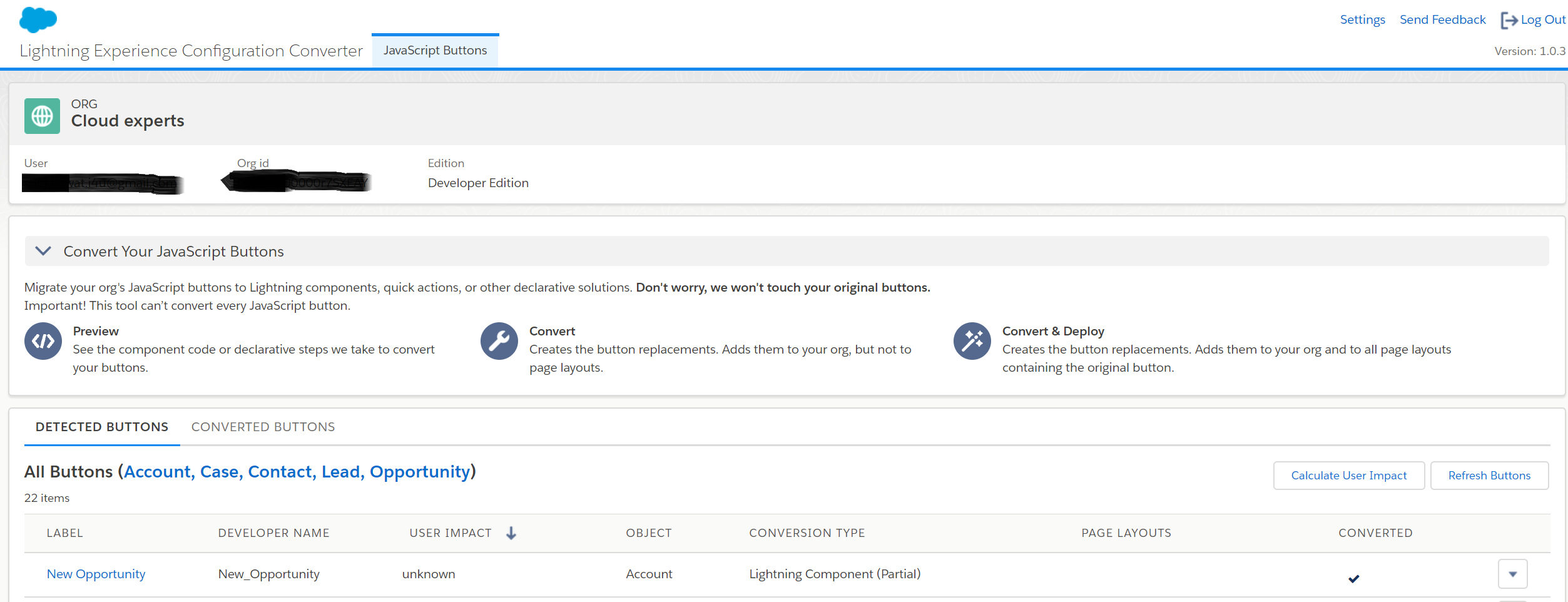
8.Move Actions and Buttons Easily When Transitioning to Lightning Experience (Beta)

Don’t have time to move all your Salesforce Classic actions and buttons into Lightning Experience? The latest Lightning Experience Configuration Converter feature does just that in a simple. Easily move custom, standard, and global actions from the Quick Actions in the Salesforce Classic Publisher section of a page layout to the Salesforce Mobile and Lightning Experience Actions section.

How: The Lightning Experience Configuration Converter is a standalone tool that lives outside of Salesforce. We recommend that you run it in a sandbox or Developer org first, then migrate your changes to your production org. To get started, visit https://lightning-configuration.salesforce.com/ and log in with your org credentials.

Untitled.png

9.View Page Performance by Browser and Other New Metrics in the Lightning Usage App

You can now view more metrics in the Lightning Usage App, including page performance by browser. You can also generate reports using the Lightning Usage App objects. To view the 10 pages where switches occur most frequently, click Switches to Classic and scroll to the Page pane.
Top ten pages where switches occur


  • To view page performance by browser, click Browser. The Performance pane displays page load times by browser for the previous 3 months and the previous 7 days.
Browser performance for past three months and past seven days

Page load time, or Experienced Page Time (EPT), is a measure of how long it takes for a page to load so that a user can meaningfully interact with it. EPT is equivalent to “critical-path” or “time-to-interaction”. Complex pages usually have higher EPT values (longer load times).

  • To view the performance of the top-viewed pages in Lightning Experience, click Page. The Performance pane shows the page load times for the most viewed pages, and the page load times of a selected page for the previous 30 days.
Performance of most viewed pages

10.Filter Search Results by Number Range

When the numbers matter, use filters to frame your search results. For example opportunities that fall within a certain amount or probability range.On the search results page, click Opportunities in the sidebar to see the available filters. Enter your target range, and click the magnifying glass.

Opportunity search results filtered by probability range and amount range

How: From Setup, in the Object Manager, go to Search Layouts for each object. Add the fields that users want to filter to the Search Results layout. You can’t filter encrypted fields.

11. Accounts: Add Multiple Account Team Members Faster in Lightning Experience

If you’ve enabled account teams, no additional setup is required to see these updates. When sales reps want to add team members from the Account Team related list on an account, they click Add Team Members. Then reps fill in the available fields for all new account team members and click Save.

Add account team members window showing multiple users and related fields

12.Leads: Reject Leads That Don’t Use reCAPTCHA

Stop spammers from sending you bogus leads. Reject leads that generate from Web-to-Lead that don’t use reCAPTCHA verification. In Setup, go to the Web-to-Lead Setup page, and look for the Require reCAPTCHA Verification setting. Enabling this setting turns on the Include reCAPTCHA in HTML setting on the Create a Web-to-Lead Form page. Then make sure that the HTML on your website includes the reCAPTCHA code.

Screen shot of the Web-to-Lead Setup page.

13.See Your Email Impact with Email Tracking

Get a 360-degree view of email activity and customer engagement. In the activity timeline and the email detail record, reps can quickly see if an email isn’t being tracked or when a tracked email was last opened. Tracking information is visible in the activity timeline.

Email tracking information

Reps can see if an email is not tracked at all; when it was last opened, or if it is tracked but unopened.

Email tracking details

If you want, add the First Opened and Last Opened fields to your email page layouts to see the information there, too.To collect and display email tracking information, you must enable Enhanced Email and Email Tracking. From Setup, enter Enhanced Email in the Quick Find box, then select Enhanced Email. Click Enable. From Setup, enter Activity Settings in the Quick Find box, and then select Enable Email Tracking.

Bounce Back from Email Bounces

Now reps know which lead, contact, or person account has a bad email address, and they know which specific email wasn’t delivered.A bounce warning appears next to the email address in lead, contact, and person account record.

Email bounce information

14.Schedule Event Series (Beta)

Let your reps schedule daily, weekly, monthly, or other repeating events from Lightning Experience and the Salesforce app.To let your reps schedule event series, on the page layout for events, add Repeat.Then, to schedule a series, reps can select Repeat.

New event page showing repeat checkbox

15.Add and Remove Meeting Participants from Any User Interface

Attendees (in Lightning Experience) and invitees (in Salesforce Classic) are linked to the same data, so updating those fields should be simple. Now when you set up sales reps to work with attendees from Lightning Experience and the Salesforce app, they don’t lose access to edit invitees from Salesforce Classic.

How: To let reps update meeting participants from any user interface, add the attendee field to the page layout for events.

16.Enjoy a Better Interface with Enhanced Run Page (Beta)

Want a faster way to review or hide a report’s count of rows, detail rows, subtotals, and grand total? We’ve included toggles for each of these options in the enhanced run page (1). The new interface also shows you the report type a report is based on (2). And, the Filters pane now displays the cross filters added to the report (3).

Improved Enhanced Run Page Interface

How: Click Switch to Enhanced Run Page (Beta) in Reports. If you need to switch back, click Switch to Legacy Run Page.

17. Edit Joined Reports with Lightning Report Builder (Beta)

Enhance your joined report workflow by editing joined reports with the Lightning report builder and with more run page functionality including filtering and sorting.

  • To view joined reports in Lightning Experience, you need the Run Reports user permission.
  • To create or edit joined reports, you need one of these permissions: Create and Customize Reports, Report Builder, or Report Builder (Lightning Experience).

How: If necessary, turn on the Lightning joined reports beta. From Setup, enter Reports in the Quick Find box, then select Reports and Dashboards Settings. Select Enable Lightning Joined Reports (Beta), and then click Save.To edit a joined report with the Lightning report builder, click Edit (Beta).

Editing a joined report (beta)

Work with joined reports on the joined report run page just like you work with other reports in Lightning Experience. For example, to work with filters, click Filter.

Running a joined report (beta)

18. Add Up to 50 Values to Each Dashboard Filter

Dashboard filters let you shine a light on specific parts of your business. Previously, you could add up to 10 distinct values (like State equals California) to a dashboard filter. Now you can add up to 50 distinct values to each dashboard filter.

Adding 50 filter values

19. Customize Axis Ranges on Dashboard Charts

Choose the range of the x- and y-axes on dashboard charts, You can only set custom ranges on axes that display a numeric field. Edit or add a dashboard component, then customize the range by selecting Custom under the X-Axis Range or Y-Axis Range. Choose both a Min and a Max range, or set only one and Salesforce sets the other for you. Some charts only let you customize the x- or y-axis. For example, horizontal bar charts let you customize only the range of the x-axis.
Setting a custom range

There are many more powerful features in Winter’19 Release notes. For complete list of Winter’19, Release Notes click here   

I will soon share Winter’19 Top Lightning Component features as well so stay tuned 🙂

Also review Winter19 release quick summary  by Salesforce MVP Rakesh Gupta.

Posted in Lightning, Lightning Charts, Lightning Component

Generating Charts Using Lightning Components

Dev Shukla  and I had worked together on a lightning venture for a couple of months and We decided to start a blog series to share our learning and experiments with “Lightning Lovers”.Many thanks to Dev Shukla for his contributor to this blog series.You can connect with Dev at twitter and check more about him here.

Generating Charts Using Lightning Components

 HighChartJs : Highcharts was released in 2009. Highcharts is a charting library written in pure JavaScript, offering an easy way of adding interactive charts to your web site or web application. Designed from ground up with mobile browsers in mind, everything from multitouch zooming to touch-friendly tooltips responds great on mobile platforms. In modern browsers graphs are rendered in SVG, with VML support for legacy browsers (e.g. Internet Explorer 6).
chart (1).png
Business Use Case:
In general we can use standard Report chart component provided by Salesforce and using app builder we can add into Lightning layouts but for complex business use case we have to develop the custom component for the same in Lightning. For example if Sales users wants to print or download the chart in Lightning and wants to share with other team users so using standard chart component you can’t export the chart.
Here I created a sample component to display my Opportunity by Stage Name and count of deals which we are having as per stage and also it will display the percentage of opportunities as per respective stages.

Here is the working demo: Live Demo

Here some of highlights of this component.

I have used HIGHCHARTS library.
1. Download the javascript from here: DOWNLOAD
2. Upload this JS file into a static resource named as “Highcharts”.

Details of this Dynamic Chart lightning component:
1. This component is used to display graphical representation of data.
2. The component is fully dynamic means it can be used for different types of graphs/charts and different data.
3. There are 6 attributes in this component.

  • ChartType: It determines the type of chart. For eg: column, bar etc.
  • ChartTitle: The title of the chart
  • chartSubTitle: The subtitle of the chart
  • xAxisCategories: The X-Axis parameters in the graph. It is an array of string.
  • yAxisParameter: The Y-Axis parameter in the graph.
  • data: It accepts JSON format of an array of object.

Here you go step by step Instructions to create the Lightning Chart component.

  1. Apex Controller


public class LinechartController {
@AuraEnabled
    public static String getOpportunityJSON(){

       List<opportunity> lstopp = [SELECT Id, stagename FROM opportunity ];
        Map<String,Integer> mapLeadSource = new Map<String,Integer>();

        for(opportunity l : lstopp)
        {
            if(mapLeadSource.containsKey(l.stagename))
            {
                mapLeadSource.put(l.stagename, mapLeadSource.get(l.stagename)+1) ;
            }else{
                mapLeadSource.put(l.stagename, 0) ;
            }
        }
        system.debug('map values--'+mapLeadSource);
        list<RadarDataWrapper> radarData = new list<RadarDataWrapper>();

        for(String key : mapLeadSource.keySet())
        {
           RadarDataWrapper rdw = new RadarDataWrapper();
            rdw.name=key;
            rdw.y=mapLeadSource.get(key);
            radarData.add(rdw);
        }
        system.debug('rdw---'+radarData);
        return System.json.serialize(radarData);
        //return null;
    }

    /**
     * Wrapper class to serialize as JSON as return Value
     * */
    class RadarDataWrapper
    {
       @AuraEnabled
       public String name;
       @AuraEnabled
       public integer y;

    }

}

2.  Lightning Component codeDeveloper Console.pngYou can take complete component code here

3.Lightning Component JS Controller Code

({
    afterScriptsLoaded : function(component, event, helper)
    {
        helper.doInit(component,event,helper);
    }    

})

4. Lightning Component Helper code

({
    doInit : function(component, event, helper)
    {
        var action = component.get("c.getOpportunityJSON");
        action.setCallback(this, function(response) {
            var state = response.getState();
            //alert(state);
            if (state === "SUCCESS") {
                var dataObj= response.getReturnValue();
                //jsonData = dataObj;
                console.log('===='+dataObj);
                component.set("v.data",dataObj);
                helper.piechart(component,event,helper);
                helper.Linechart(component,event,helper);
                helper.donutchart(component,event,helper);
            }
        });
        $A.enqueueAction(action);
    },
    piechart : function(component,event,helper) {
        var jsonData = component.get("v.data");
        var dataObj = JSON.parse(jsonData);

        new Highcharts.Chart({
            chart: {
                plotBackgroundColor: null,
                plotBorderWidth: null,
                plotShadow: false,
                renderTo: component.find("chart").getElement(),
                type: 'pie'
            },
            title: {
                text: component.get("v.chartTitle")+' (Pie Chart)'
            },
            subtitle: {
                text: component.get("v.chartSubTitle")
            },
            xAxis: {
                categories: component.get("v.xAxisCategories"),
                crosshair: true
            },
            yAxis: {
                min: 0,
                title:
                {
                    text: component.get("v.yAxisParameter")
                }
            },
            tooltip: {
                pointFormat: '{series.name}: <b>{point.y}</b>'
            },
            plotOptions: {
                pie: {
                    allowPointSelect: true,
                    cursor: 'pointer',
                    dataLabels: {
                        enabled: true,
                        format: '<b>{point.name}</b>: {point.y} ',
                        style: {
                            color: (Highcharts.theme && Highcharts.theme.contrastTextColor) || 'black'
                        }
                    }
                }
            },
            series: [{
                name:'StageName',
                data:dataObj
            }]

        });

    },

    Linechart : function(component,event,helper) {
        var jsonData = component.get("v.data");
        var dataObj = JSON.parse(jsonData);

        new Highcharts.Chart({
            chart: {
                plotBackgroundColor: null,
                plotBorderWidth: null,
                plotShadow: false,
                renderTo: component.find("linechart").getElement(),
                type: 'line'
            },
            title: {
                text: component.get("v.chartTitle")+' (Line Chart)'
            },
            subtitle: {
                text: component.get("v.chartSubTitle")
            },
            xAxis: {
                categories: component.get("v.xAxisCategories"),
                crosshair: true
            },
            yAxis: {
                min: 0,
                title:
                {
                    text: component.get("v.yAxisParameter")
                }
            },
            tooltip: {
                pointFormat: '{series.name}: <b>{point.y}</b>'
            },
            plotOptions: {
                line: {
                    dataLabels: {
                        enabled: true
                    },
                    enableMouseTracking: false
                }
            },
            series: [{
                name:'StageName',
                data:dataObj
            }]

        });

    },
    donutchart : function(component,event,helper) {
        var jsonData = component.get("v.data");
        var dataObj = JSON.parse(jsonData);

        new Highcharts.Chart({
            chart: {
                renderTo: component.find("donutchart").getElement(),
                type: 'pie',
                options3d: {
                    enabled: true,
                    alpha: 45
                }
            },
            title: {
                text: component.get("v.chartTitle")+' (Donut Chart)'
            },
            subtitle: {
                text: component.get("v.chartSubTitle")
            },
            tooltip: {
                pointFormat: '{series.name}: <b>{point.percentage:.1f}%</b>'
            },
            plotOptions: {
                pie: {
                    innerSize: 100,
                    depth: 45
                }
            },
            series: [{
                type: 'pie',
                name:'StageName',
                data:dataObj
            }]

        });

    }
})

Here is Output of Component :

This slideshow requires JavaScript.

GitHub Repository
You can also download the code from the github repository here.

References :

Building Lightning Components with Chart.js

Create Lightning Charts With Chart.Js

Graphs and Charts: Lightning Component